
End-to-end redesign of Foster Books' website, the oldest secondhand and rare bookshop based in Chiswick, London.
The goal was to improve navigation, search clarity, and overall discoverability.
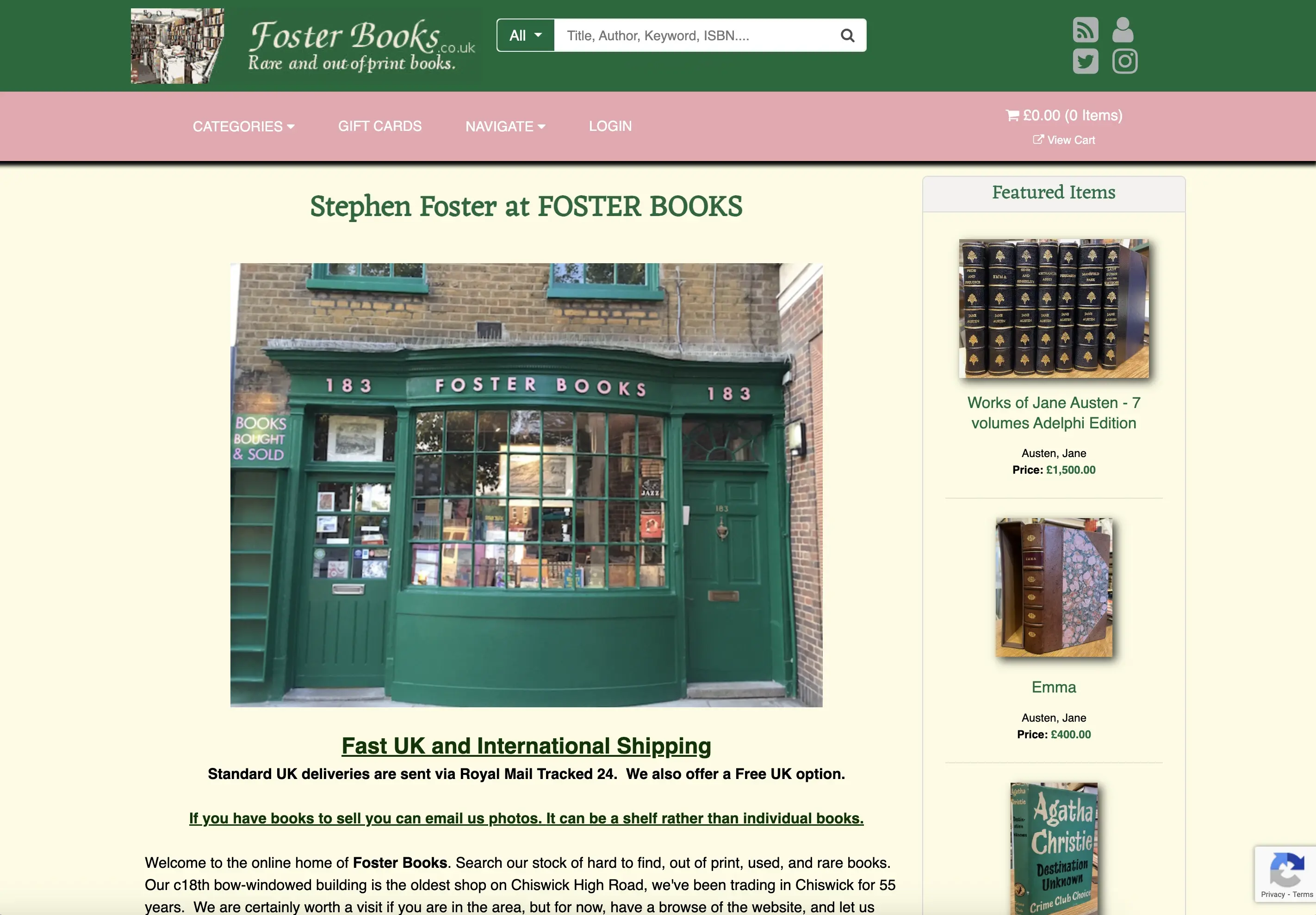
I walk past Foster Books almost every day, always drawn to its warmth and whimsy. But when I found their website, it felt plain and text-heavy, missing the magic of the shop.
This redesign was my way of bringing that charm online.
Did you know? Foster Books isn't just a local gem, it's also a go-to source for film and TV sets. Owner Stephen Foster has supplied rare volumes for Bright Star, Sherlock Holmes, and even James Bond: Spectre.
standard.co.uk
Problem
Fosterbooks has an online presence, but struggles with the conversion rates. While the website receives traffic, poor navigation and unclear categorisation make it difficult for users to find and purchase books.
Solution
1.
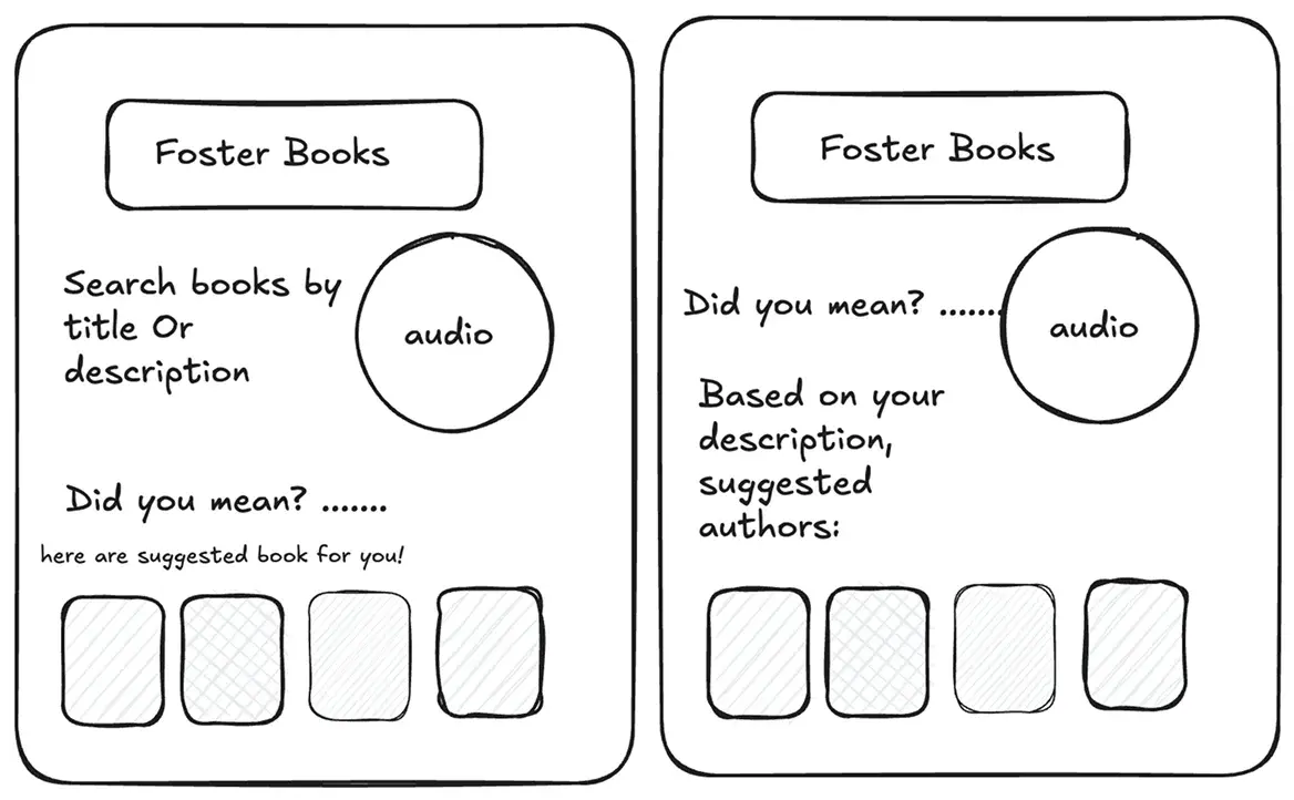
Smart search that guesses titles as you type, even if you’re unsure of spelling.
2.
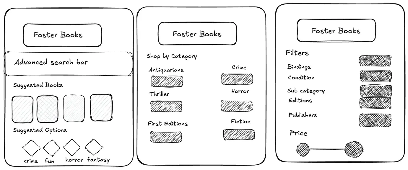
Simplified categories using card sorting, to make browsing feel less overwhelming.
3.
Advanced filters to sort by binding, edition, and condition easily.
My Contribution
•
UX Research
•
UI Design
•
Product Design
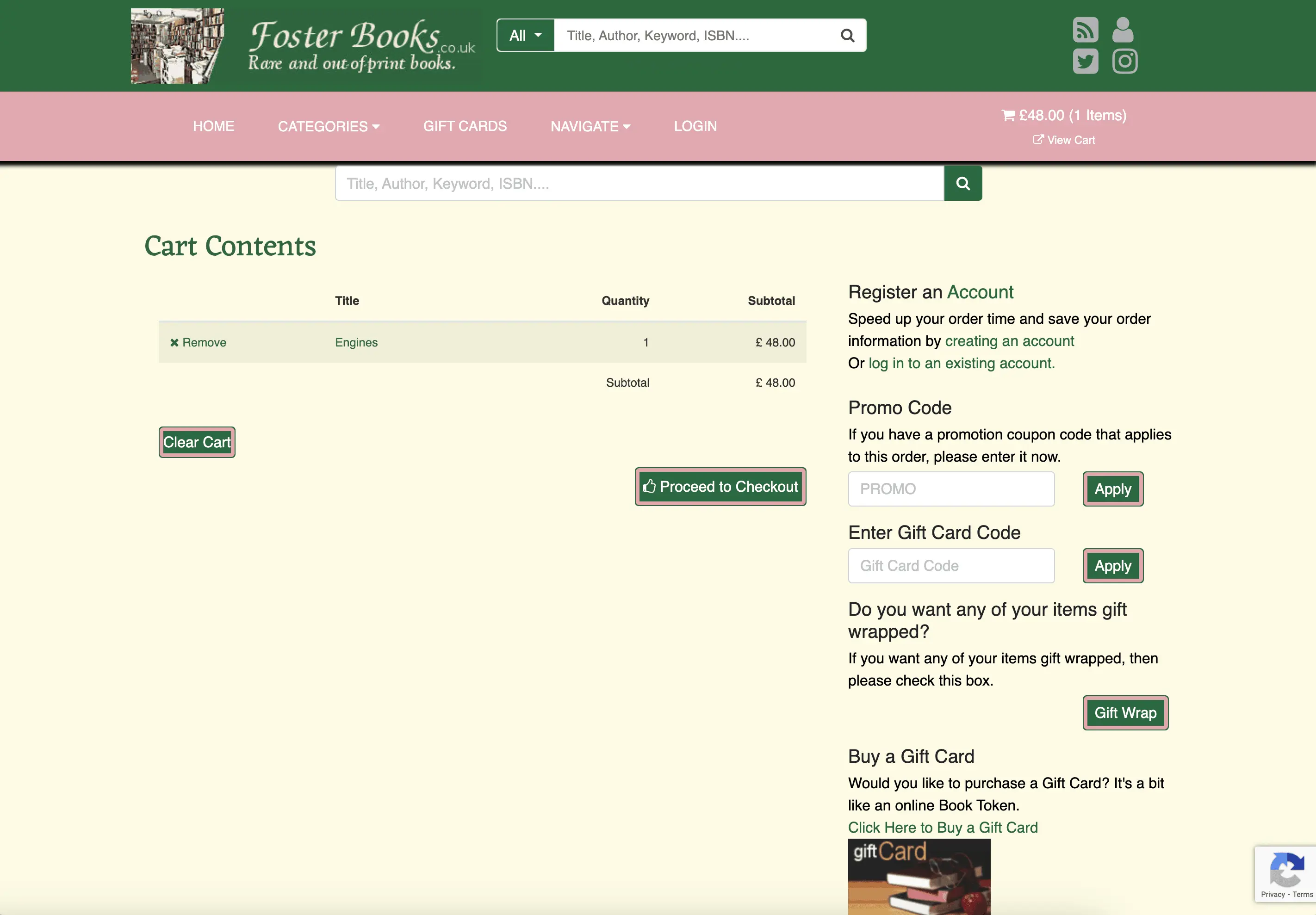
The old search often returned confusing or broad results. I added a more helpful search experience that suggests book titles, authors, and categories as users type.
This made it easier to find what they needed without guessing keywords. Search time dropped from 5 minutes to less than 2 minutes.
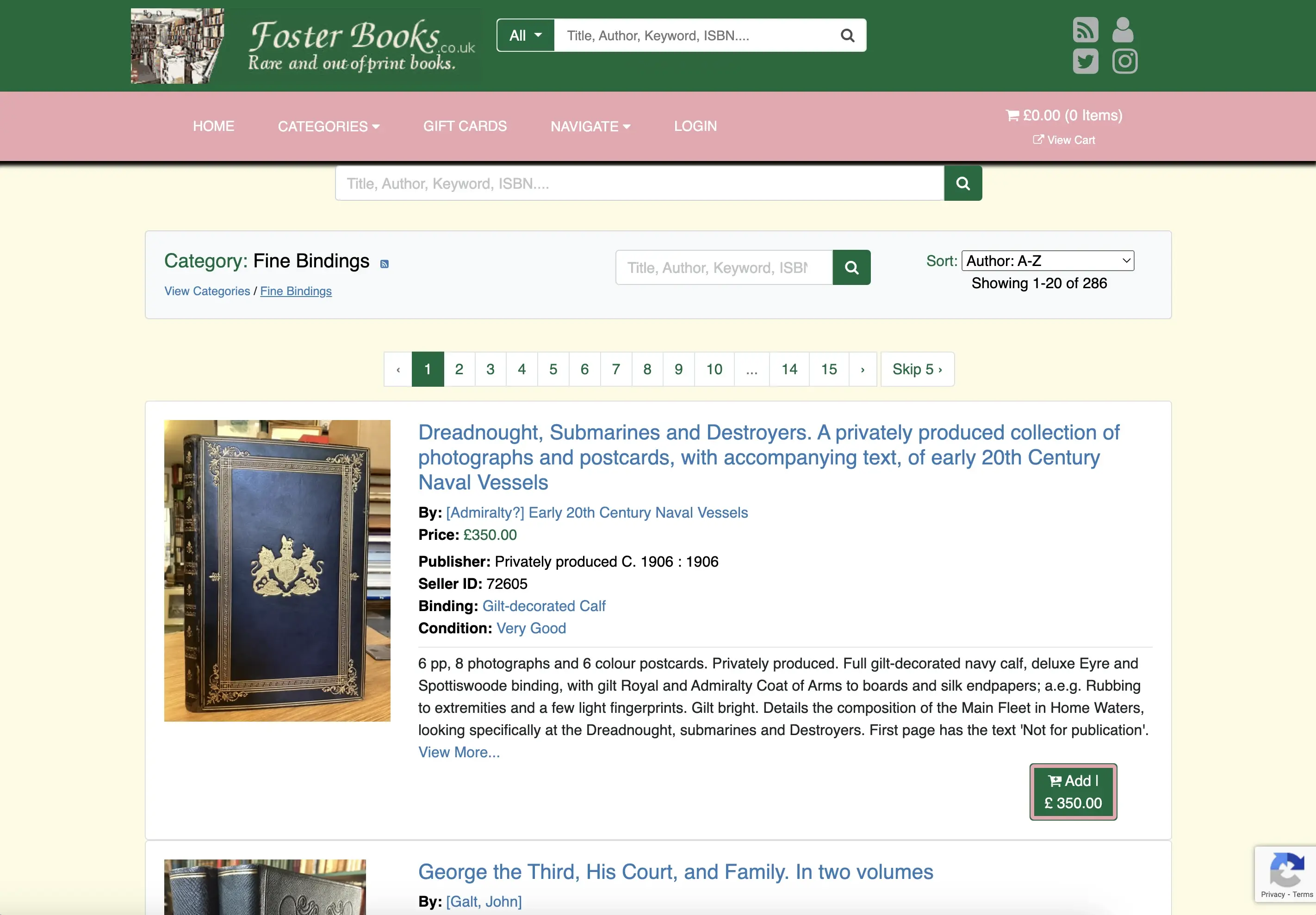
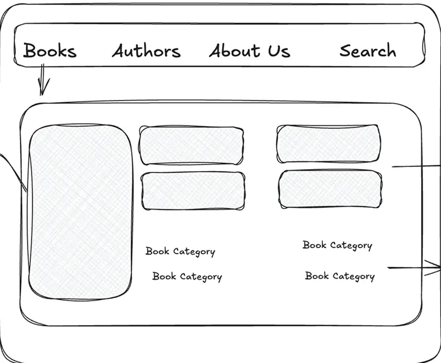
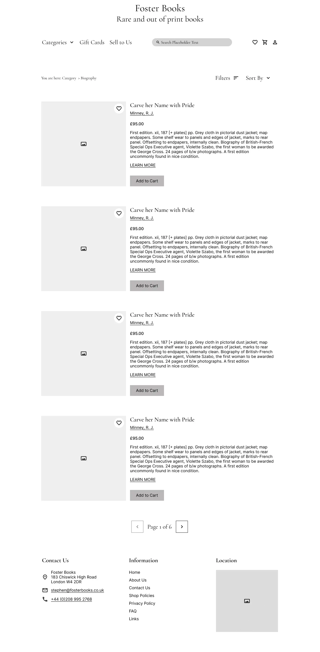
The original category layout was cluttered and hard to scan, with categories buried under pagination.
I grouped 20+ scattered links into 8 clear genres using card sorting, making browsing quicker and easier.
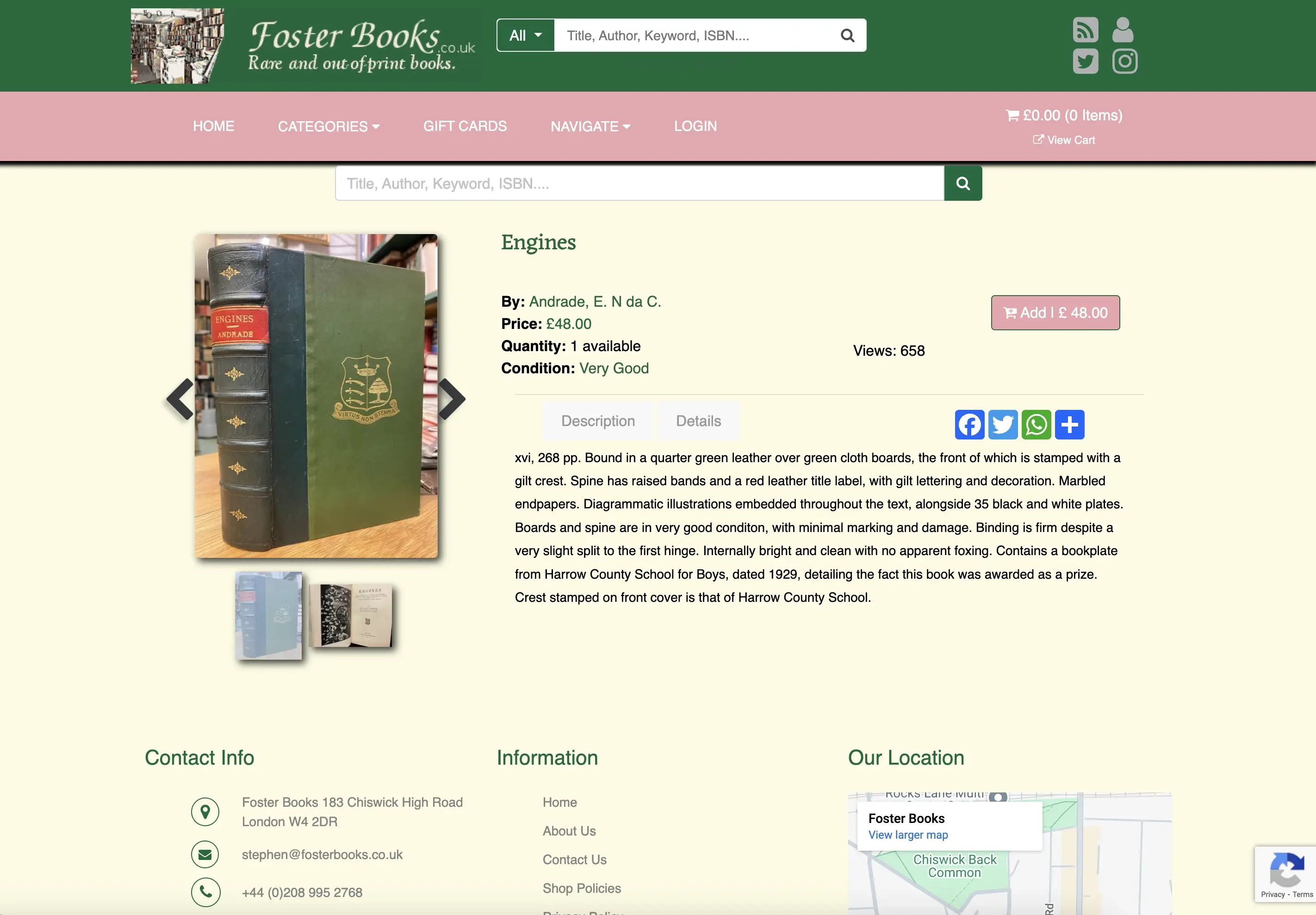
The original site had no filtering options, making it hard to narrow down results.
I added filters for genre, author, price, and condition, helping users find the right book faster with fewer clicks.
SUS score improved from 36 to 95% after the redesign.
Time to find books decreased to 2 minutes from 5 minutes.
Users expressed higher confidence in the website’s navigation.
I started by using the website as a user, searching for a particular type of book, browsing through categories, trying to start over if I got stuck. I noticed some issues right away, but wanted to dig deeper. So I ran a Heuristic Evaluation and Accessibility Audit to uncover the core problems.
While reviewing the homepage, I spotted issues like low contrast, small tap targets, and underlined text that wasn't actually clickable. Below is a snapshot of a deeper Accessibility Review.
This process helped me understand how visual design choices impact usability, and it gave me the clarity I needed to move into a broader Heuristic Evaluation.
After noticing a few things felt off at first, I used my favorite Abbys' method on the current website to look closer. It helped me spot gaps across the whole journey, from browsing to checkout, and gave me a clearer idea of what to explore next.
While I found several smaller issues, these three stood out the most , they kept showing up and could really affect how smoothly someone moves through the site.
Navigation Gaps
Important actions were hard to find due to poor navigation.
Inconsistent Visuals
Inconsistent categories, fonts, and alignment made the interface feel messy.
Unclear Feedback
Error messages and confirmations were either missing or poorly worded.
Want to dive deeper? View full heuristic evaluation
Noticing the same issues pop up made me wonder what it's really like for someone using this in real life. This curiosity led me to my first question:
That question became the starting point for my next step: understanding how others experience that same challenge.
I conducted 3 user interviews to understand how users experience the website.
Before testing the site, I wanted to understand how people shop for secondhand books online.
Since I couldn’t reach many Foster Books customers, I interviewed eight people including collectors, casual readers, and others with experience in rare book buying to uncover key pain points and behaviours.
Most users said they wouldn’t buy a book if the site “looked sketchy”, even if the book was perfect.
Here are a few key insights:
Rely on images and reviews while ordering books online
Want clear description of books showing table of content
Need an efficient search engine to find things faster
Find complex navigation a waste of their time
I could also see two clear patterns emerging from the insights:

Direct Searchers - 70%
Users who knew exactly what they wanted but needed a fast, reliable way to find it.
“I know exactly what I want. I just need to get to it quickly.”

Curious Explorers - 30%
Users who browse casually to find interesting books, akin to exploring bookstore shelves.
“I want the site to feel like a library bookshelf I can wander through”
The research showed that people browse in different ways. Some move quickly, others like to explore. The interviews revealed behaviours and frustrations that pointed me toward clearer search, simpler navigation, and more trust-building design. This also shaped how I planned usability testing.
After identifying key user needs, I ran usability tests with five potential Foster Books users to see how well the experience supported them.
The goal was to uncover frustrations, spot areas for improvement, and surface any pain points along the way.
Imagine you're buying a book you've been meaning to get. Show me how you'd find it, add it to your cart, and check out.
How it all measured up
Users managed to complete the main task
Average time users spent on main task
on average
Average SUS score
Here's what happened when users tried to complete the main task on the current site:
Irrelevant results and low accuracy made users lose trust in search.
A flat layout and dense pagination made scanning difficult and increased cognitive load.
Without filters or guided paths, users couldn't orient themselves or browse with intent.
Each of these insights became a lens for rethinking not just the UI, but the entire way finding model of the site. The deeper I went, the clearer it became: this wasn't just about improving search or simplifying categories. Users weren't just getting stuck, they were losing trust in the experience entirely.
To build on these findings, I looked at how Waterstones and Peter Harrington handle search and categories.
Waterstones, a direct competitor, offers a broad secondhand selection, while Peter Harrington focuses on rare and collectible books.
Clear categorisation
Highlighting genre and authors makes discovery easier and reduced scroll fatigue.
Visual detail
Clear images and short descriptions helps users trust listings and decide faster.
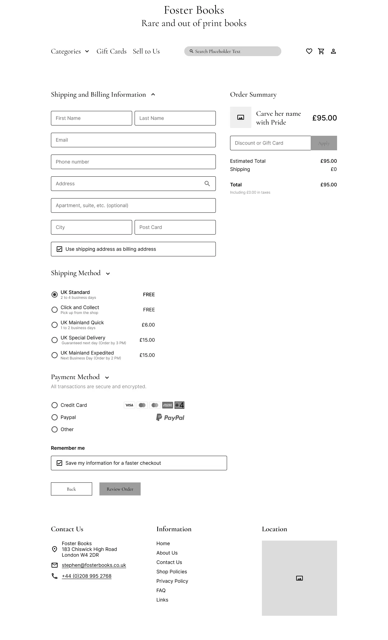
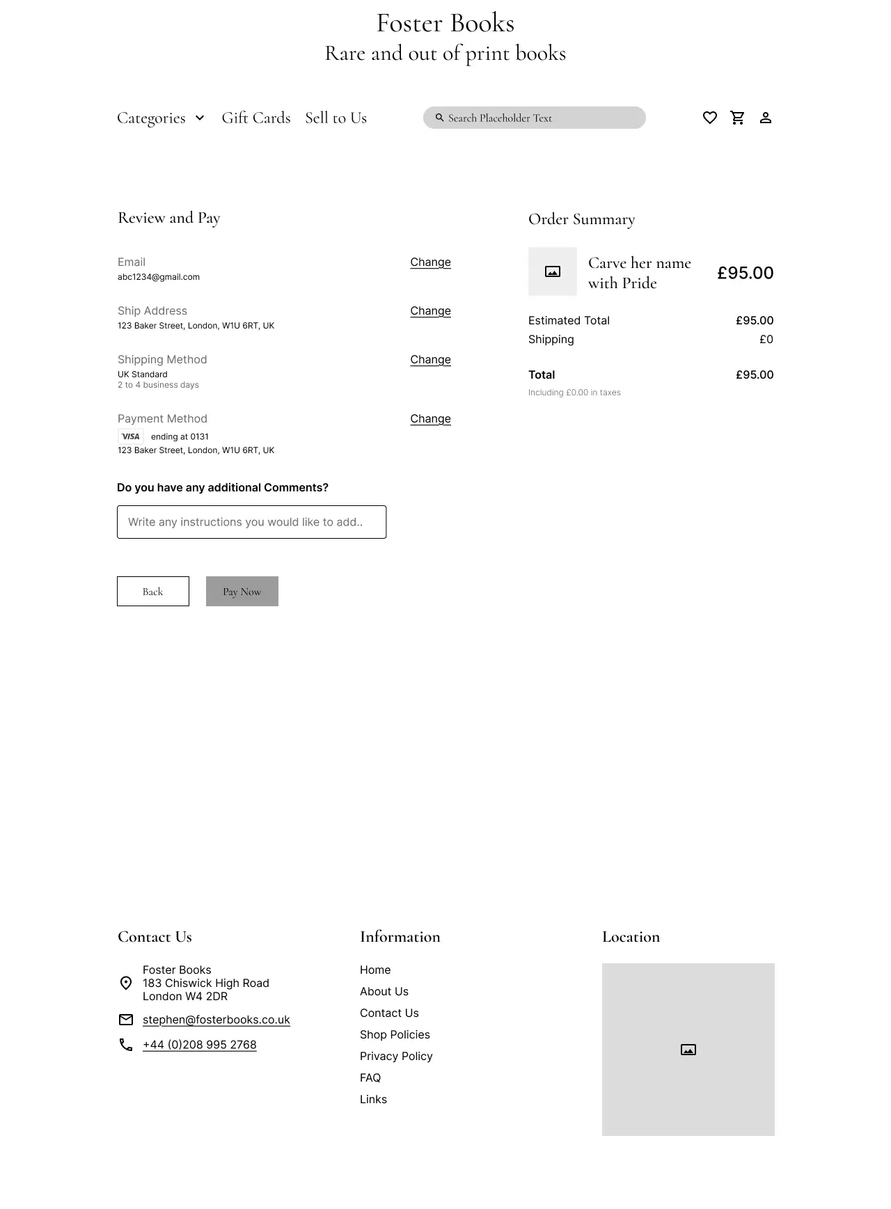
Simplified checkout
Fewer fields and clear steps make checkout faster, easier, and more trustworthy.
After digging through research and competitor insights, I needed clarity on who I was really designing for. I created a persona to zoom in on users’ goals, habits, and frustrations.
Taylor loves the charm of old books and the thrill of discovering hidden gems. But poor images and confusing navigation often break the spell. She just wants a simpler, clearer way to find the stories she loves.
Wants a quick and structured way to find books.
Needs detailed images and descriptions to assess book condition.
Prefers immediate purchase confirmation for a seamless experience.
Ryan loves the ease of online book shopping and gets excited by discounts and fast delivery. But when websites lack transparency or a clear checkout, they lose trust and drop off.
Needs good customer service to make the buying process smooth and stress-free.
Needs secure payment options to protect their information and build trust during checkout.
Needs clear and transparent shipping information to avoid surprises.
While the design centered around one primary persona, the second helped me stay mindful of other needs and edge cases. Together, they gave the problem sharper focus and helped guide my design decisions.
After building Taylor’s persona, I mapped her experience across the site to see how she moved through it and where things became difficult.
She started off feeling clear about what she wanted. That changed once she began searching. The results didn’t match, the categories felt unclear, and there were no filters to help her narrow things down.
Steps
Arriving on the website
Searching for a book
Reviewing book details
Checkout & Completion
Actions
Taylor lands on the homepage of the bookstore website
Taylor uses the search bar to look for vintage books
Taylor clicks on a book listing to check details, reviews and pricing
What will make them purchase the book?
Thoughts
"I hope this site is easy to navigate and helps me find what I need quickly"
"I just want to find this book without scrolling endlessly"
"Is this the right edition? What's the book's condition? Are there better options?"
"I hope checkout is simple, and I don't have to create an account just to buy one book"
Pain Points
Cluttered homepage, unclear categories
Poor search results (irrelevant suggestions). No option to filter by edition, year, or condition
Lack of clear book descriptions and clear images
Complicated checkout process. Too many steps
Emotions
Once I had a clearer view of what users needed and where they were getting stuck, I was able to define the main goal of the project through a focused problem statement.
The problem at a glance:
From this point on, I shifted focus from adding features to reducing friction. The goal became less about redesigning the interface and more about helping users explore without getting lost.
With clearer insights, I moved into ideation with a focus on flow, clarity, and trust. I sketched different ideas, mapped user flows, and explored ways to make browsing feel easier and more intuitive.
To make filters meaningful, I needed to first fix the structure. I ran a closed card sort with 10 participants using UX Tweak to see how users naturally group books. The set included genres, authors, and bindings to test a variety of mental models.
This highlighted how niche categories were seen more as secondary details better suited for filters, confirming users needed simpler, more familiar starting points.
History, Novels, Literature, Biography
Poetry, Kids
Pop, Travel, Lifestyle, Gothic
This helped reshape the category system around how users actually think. Once that felt right, it was time to tackle the search experience.
To kick off ideation, I turned my problem statement into focused HMW questions. This helped me to stay outcome-driven and explore ways to simplify navigation while supporting the business’s goal of increasing discoverability.
Out of the many HMWs I explored, a few were solid enough to shape the direction of our early sketches (bless the warm-up phase).
My first few HMWs are always chaotic, vague, and slightly embarrassing, but once I warm up, I start making sense (mostly).
HMWs that helped me bookmark the real problems
I really enjoyed the HMW exercise because it helped me shift focus from features to user emotions and outcomes, which made ideation more meaningful.
To explore solutions, I ran a rapid Crazy 8s session using my selected HMWs. It helped me quickly visualise ideas and lay the groundwork for my low-fidelity wireframes.
However, some of my ideas didn’t reach quite far.
If my sketches had soundtracks, some would be chaotic pop remixes. Some would be rainy day jazz. I’d keep the ones that feel like a loop I’d replay.
Ideas that didn't make it
Mega dropdown menu: Users still had to scan through 20+ options.
How might we structure categories to reduce confusion and mental effort?
What stuck
Advanced Search Navigation: Adding smart search bar that guesses titles as you type, even if you’re unsure of spelling, along with simplified categories and more personalised Filters.
How might we make search feel like finding a favourite dress in your own closet?
Refining the navigation through simpler categories and meaningful filters made the flow feel clearer and more intuitive. This phase also reminded me how powerful quick sketches can be, not just for sparking ideas, but for sharpening direction and bringing clarity to the next steps in ideation.
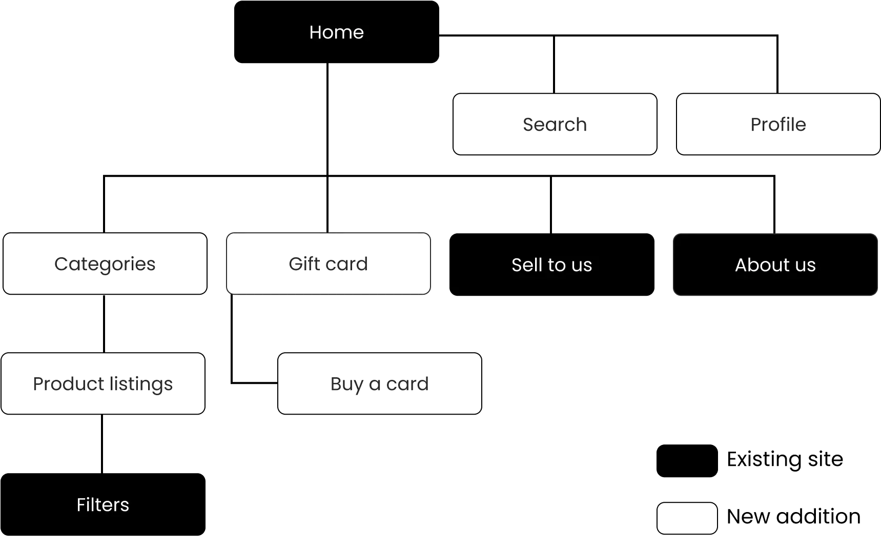
I updated the existing sitemap using the ideas I had so far. This helped me see how the new structure could improve navigation while keeping the feel of the original site.
Building on the sitemap, I created user flows to map how Taylor would navigate through the site and interacts with the improved features. This helped visualise her journey and ensure a smooth experience while completing key tasks.
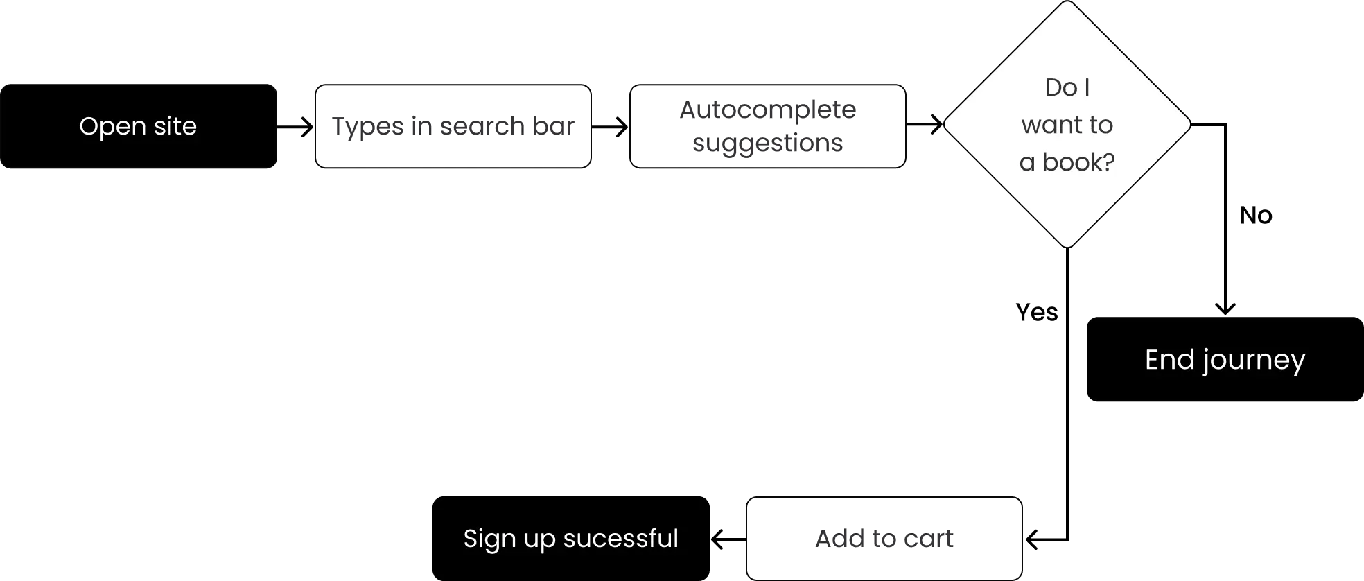
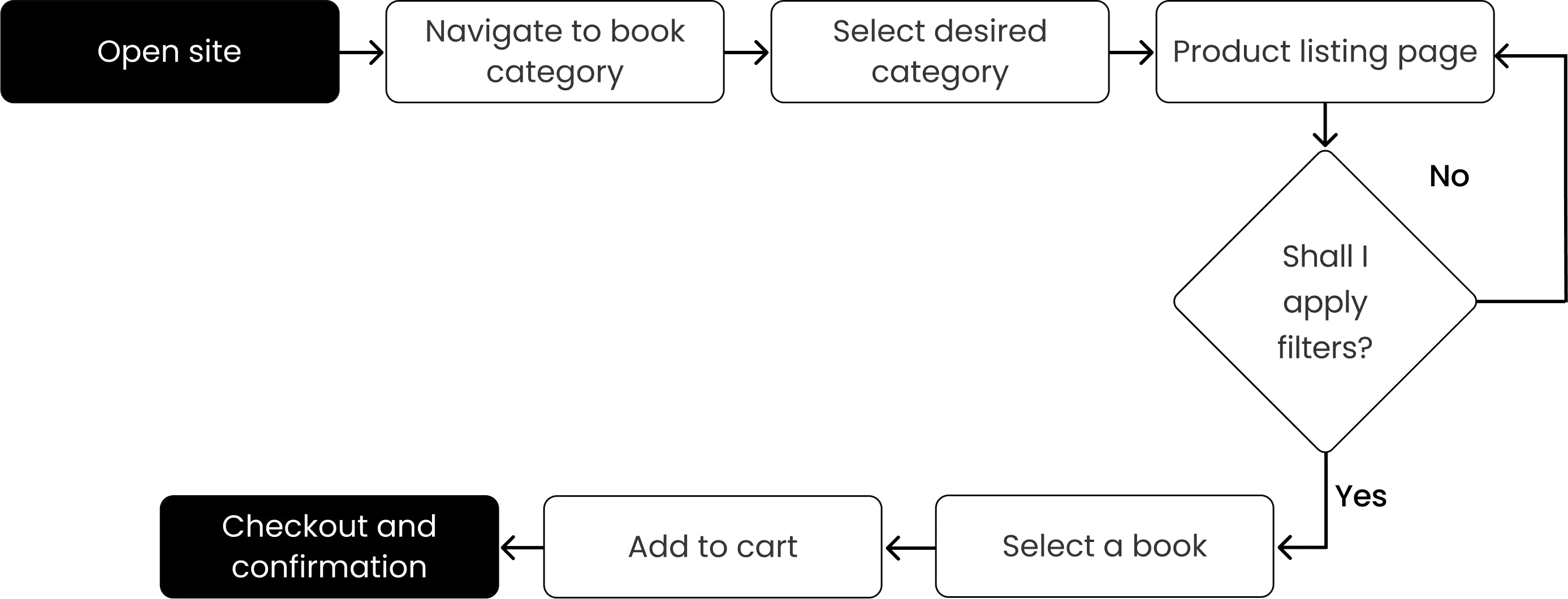
The user flows helped me understand the key interactions and navigation patterns users would follow. This set the stage for focused ideation.
After narrowing down my ideas, I decided to focus on three key areas to keep it focused and add clarity. These became the foundation of my wireframes and guided our decisions during prototyping and testing.
I started with mid-fidelity wireframes which helped me to shape ideas, test layouts quickly, and stay flexible before refining details.
I conducted one round of usability testing with 5 users, giving them the task of finding a vintage poetry book and checking its condition before deciding to purchase it.
The test aimed to see if users could complete the task and recover from mistakes. I used their feedback to adjust the design and improve the overall experience.
Task
User 1
User 2
User 3
User 4
User 5
User 6
Avg Time on Task
Success Rate
2:10
1:00
1:20
0:55
2:30
1:35
1:45
0:50
2:05
0:58
1:02
1:20
0:35
0:42
1:05
0:48
0:50
0:48
1:30
0:59
1:45
0:50
1:10
1:14
Key Takeaways:
1.
All users completed tasks, but some took indirect paths. This was most common when browsing by genre or using condition filters.
2.
Condition filters were unclear. Terms like “Good+” confused users and caused delays.
3.
Checking availability was smooth. Users completed this task quickly and without issues.
This feedback helped me in making further UI adjustments that made each step clearer for users.
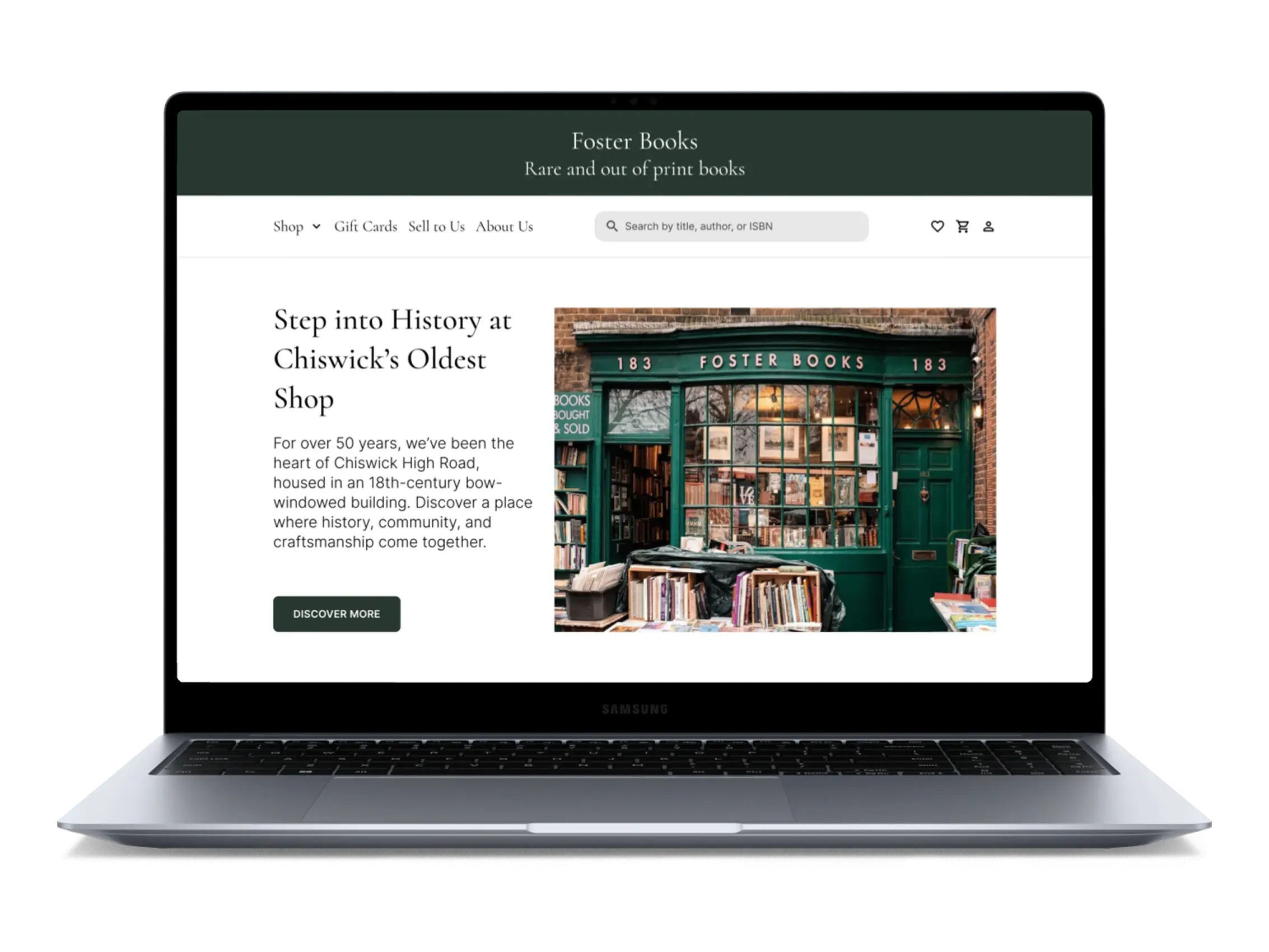
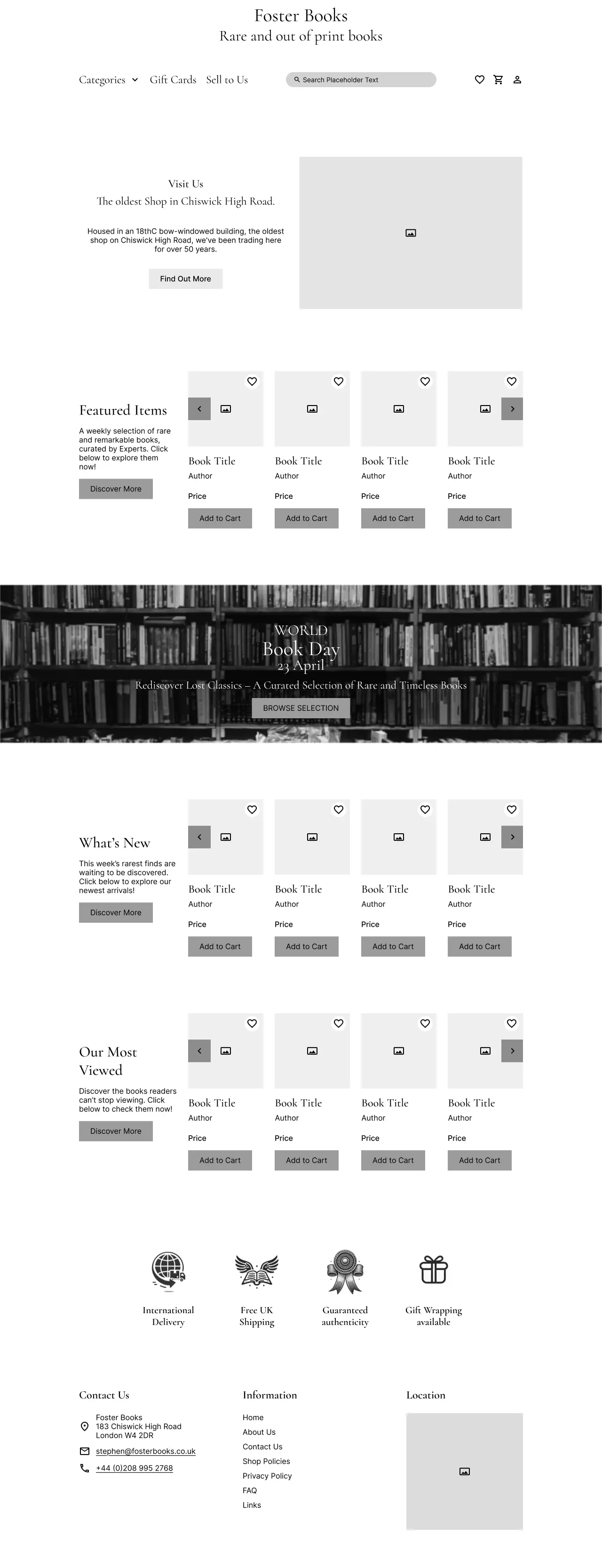
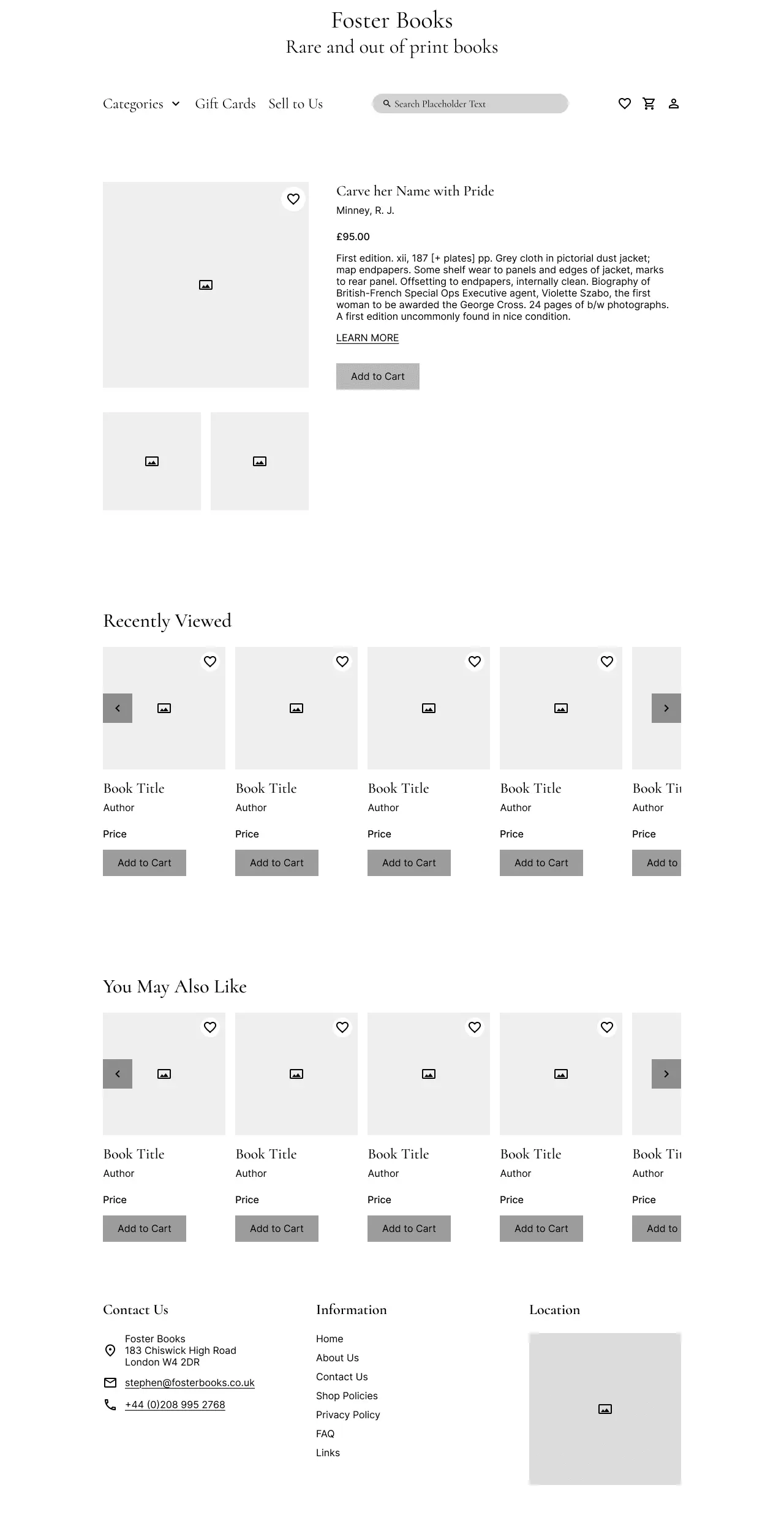
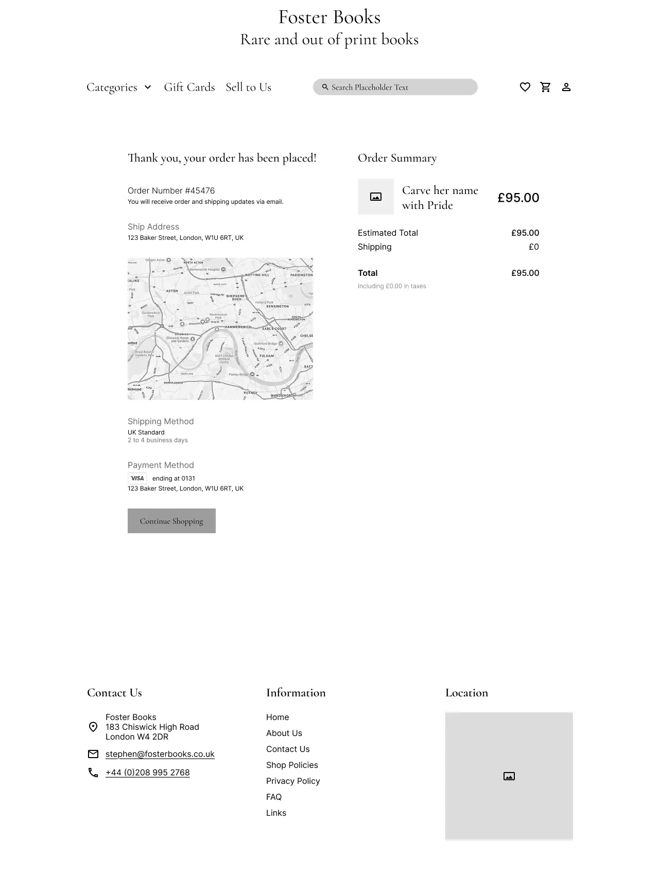
Foster Books didn’t have a set visual identity, so I created a vintage-inspired palette using tones that reminded me of old paper, worn leather, and forest greens. I kept black for key actions to make things pop and stay accessible. The goal was to make the site feel calm, trustworthy, and rooted in the charm of secondhand books.
While this project was conceptual, the redesign was tested and iterated based on real feedback. Here’s what the shift looked like:
If I had more time (or if this project were handed off), I’d explore:
•
Book reviews and previews to build decision-making trust
•
Mobile-first flow testing, especially for repeat customers
•
Analytics modeling, such as bounce rate reduction and click-through paths from search
This project pushed me to go beyond surface-level fixes. The biggest lesson? Fixing the UI means nothing unless the system underneath makes sense. Some other takeaways:
•
A broken logo link says more than it seems , small things break trust.
•
Users don't want to feel “efficient”; they want to feel oriented.
•
Sometimes the best feedback isn’t usability metrics , it’s when someone says: “This feels like an actual bookshop.”


